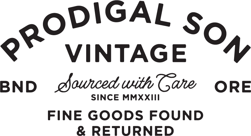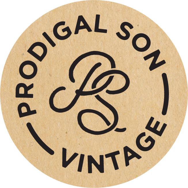
PRoDIGAL SON
When the owners of a local vintage reseller reached out and pitched their new venture, “Prodigal Son” to me, I was all-in right away. With impecable taste for details and an instinct for curating goods and that make any Pacific Northwest guy swoon, it was clear we were on the same page right from the start.
BRAND STRATEGY | DESIGN | COPYWRITING
INDUSTRY IN-STYLE
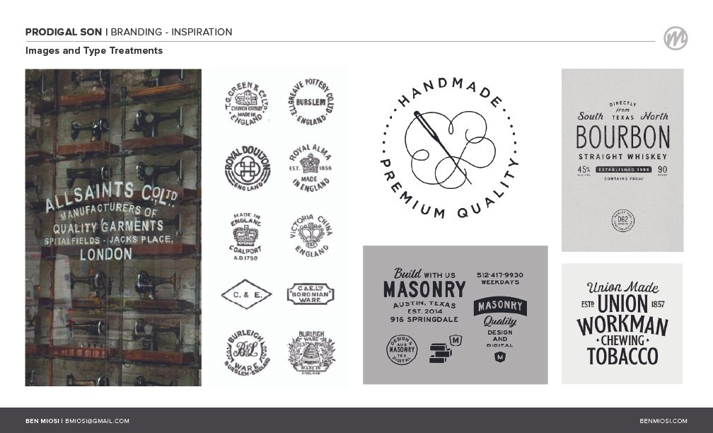
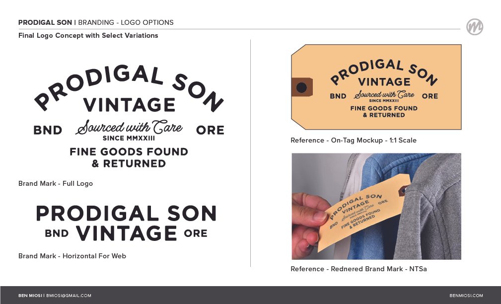
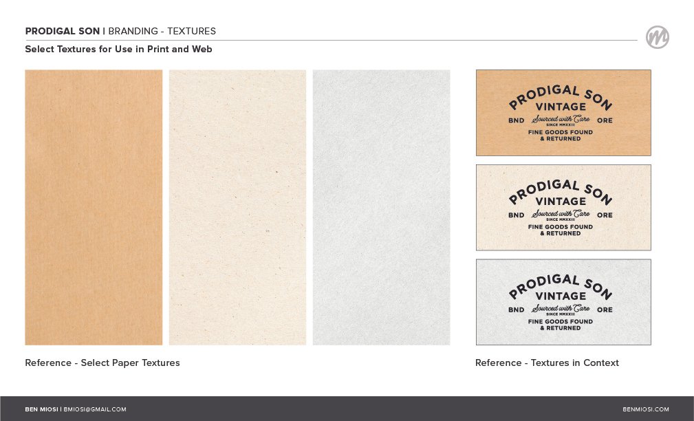
Since this effort was predominantly inspired by looks, fabrics, and finishes from the industrial era, most of the design inspiration came from the practical details in and around those spaces. Hand-painted storefronts, stamped makers marks, and simple, pragmatic forms were interpreted to create a simple, yet elegant representation of the brand.

SCOPE AND CONSIDERATIONS
SIMPLE AND INDUSTRIAL
Brand mark to be inspired by hand-rendered signs and industrial lettering of the past century.
RETAIL-FOCUSED
Most assets will be in support of pop-up retail events in and around the Pacific Northwest
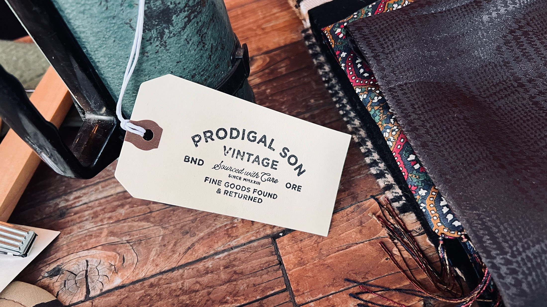
MADE FOR STAMPING
The primarty use of the brand mark is to be a physical stamp, hand-applied to tags for each event.

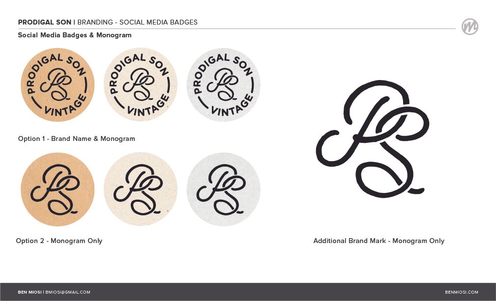
BRAND MARKS AND SUPPORTING ASSETS