SILIPINT
When I joined Silipint in April of 2022 they were beginning to evolve the business from a promotional-only focus to being retail-ready nationwide. As Creative Lead, my objective was to establish scalable visual standards, while preparing the brand for growth.
DESIGN LEAD / CREATIVE DIRECTORESTABLISHING BRAND STANDARDS
Working closely with Product and Marketing teams, we identified three, overarching brand differentiators, around which all other creative assets would revolve.

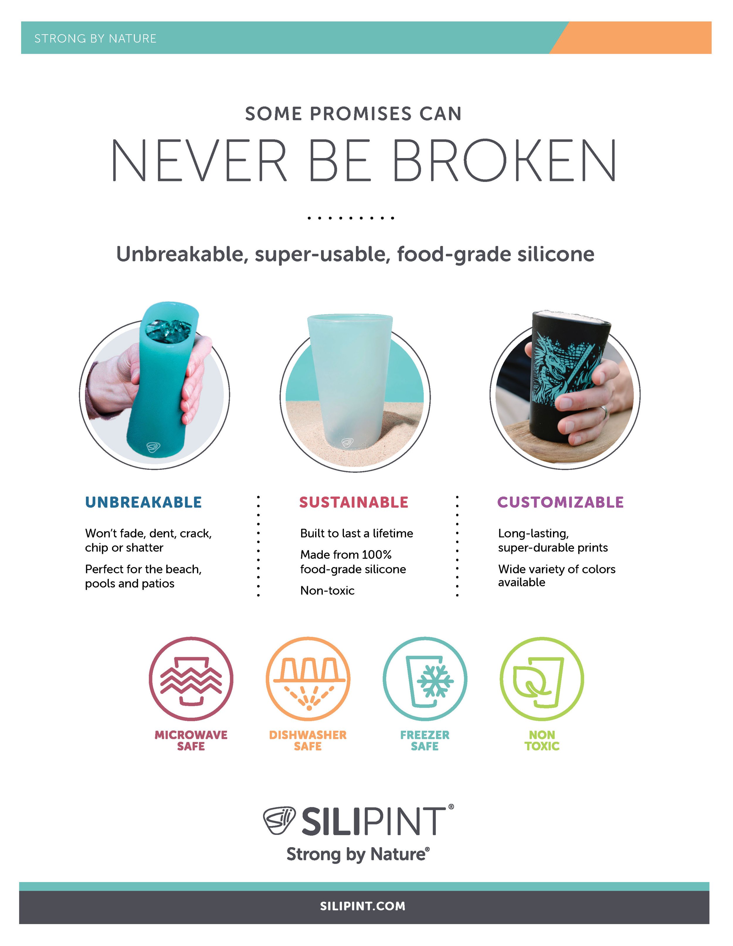
Unbreakable
The primary brand message was durability, a key differentiator from competitors.

Sustainable
Being entirely plastic-free and “made from sand” were primary messages throughout.

Customizable
Silipint’s in-house printing capabilities enabled industry-best customization
STYLE GUIDE


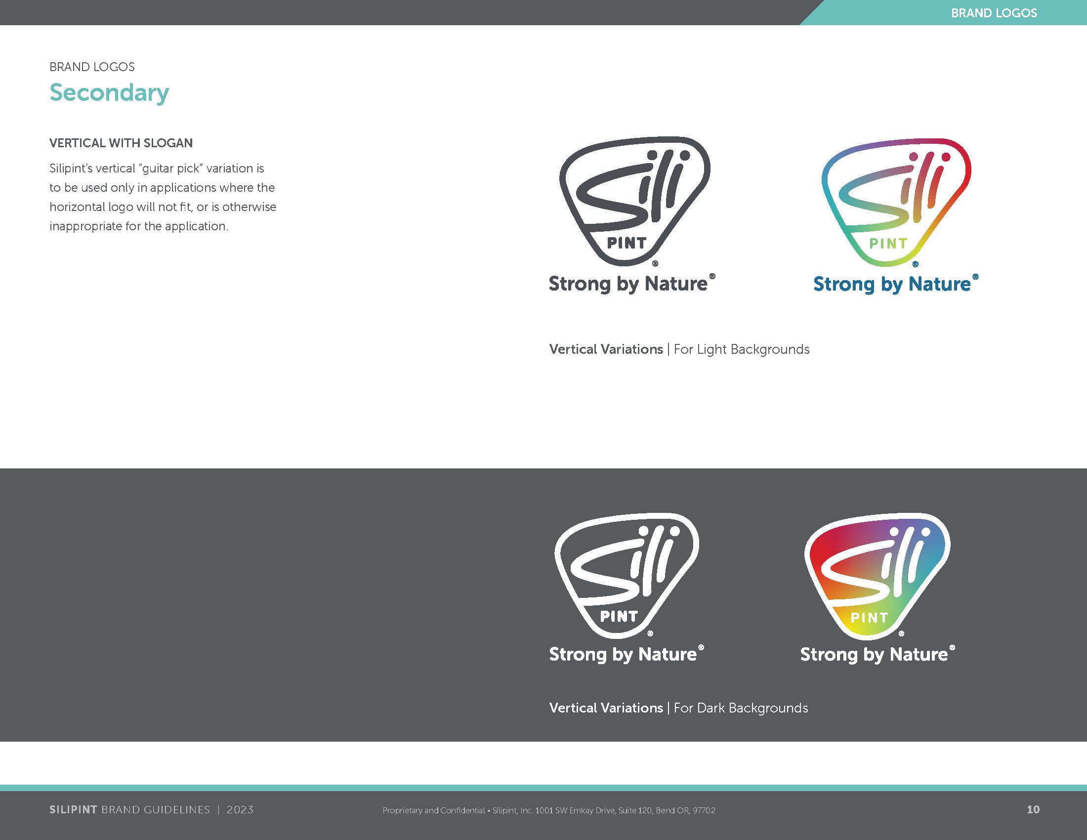
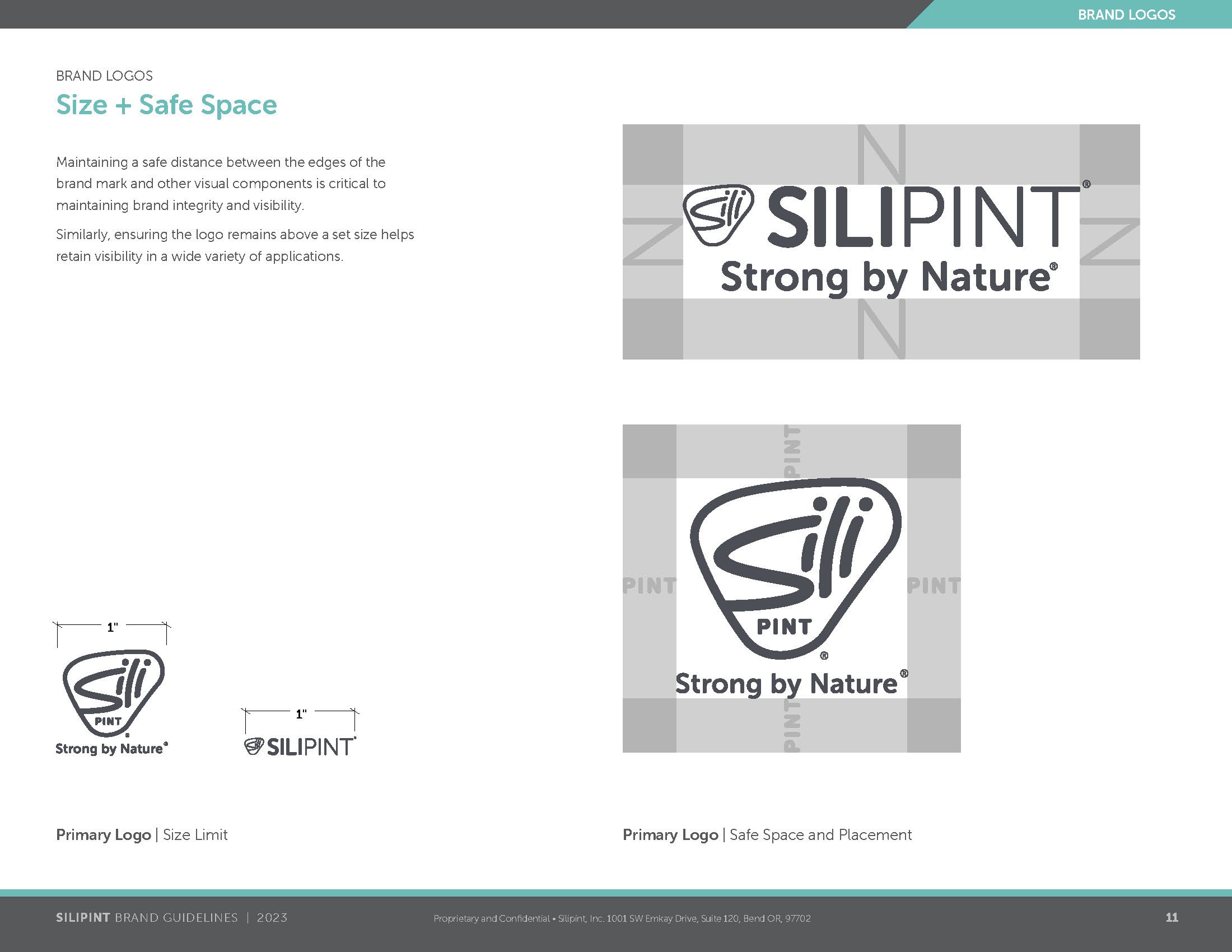


BRAND MARK LIMITATIONS
One of the first and highest priorities was to expand the single (and only) brand mark to provide a wider range of flexibility in both print and on the web, without deviating too dramatically from the original.

Full gradients can be difficult to print consistently and create wider visibility challenges on all platforms.
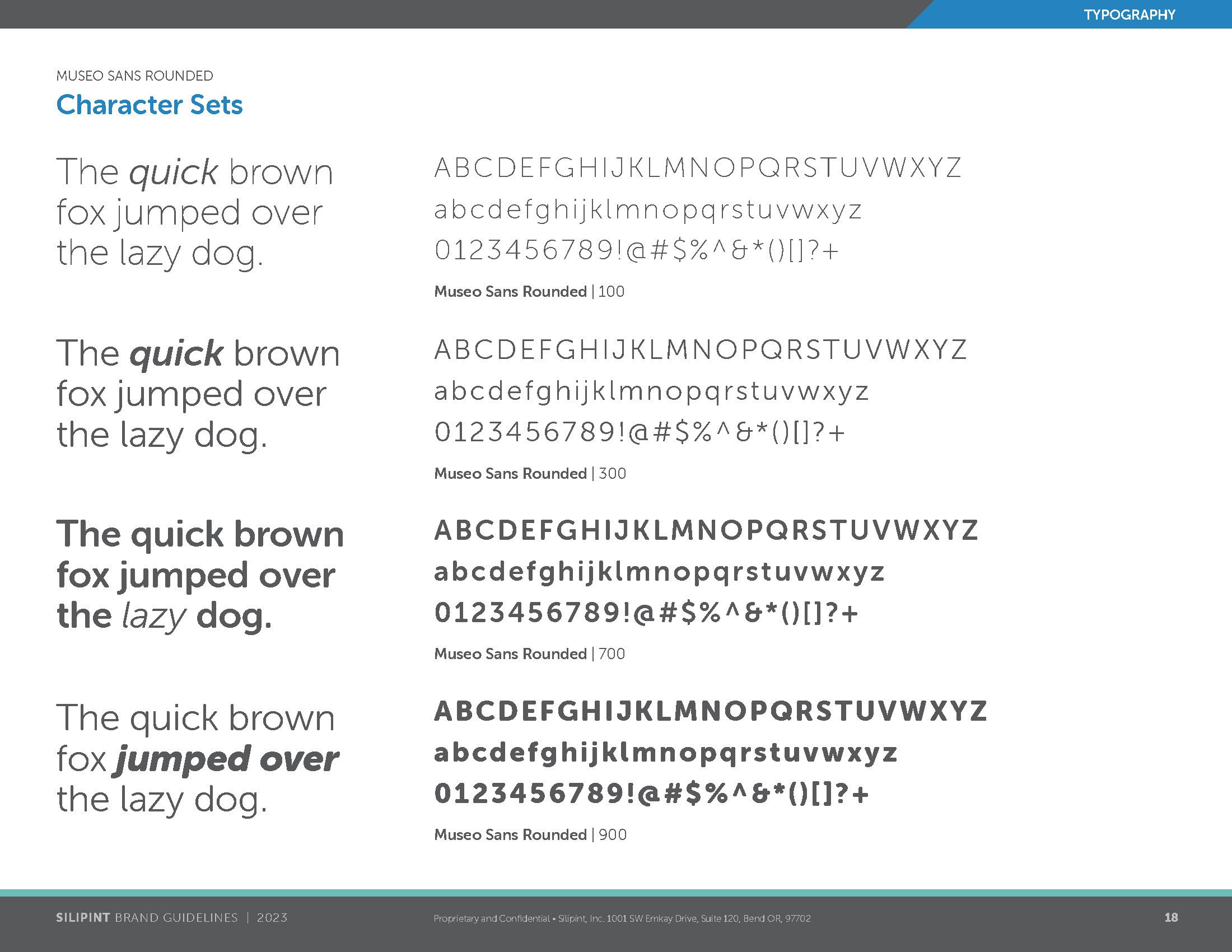
The included typeface presented numerous limitations and licensing complications.
Without variations, visibility across necessary platforms would be significantly reduced.
CORE BRAND MARK UPDATES
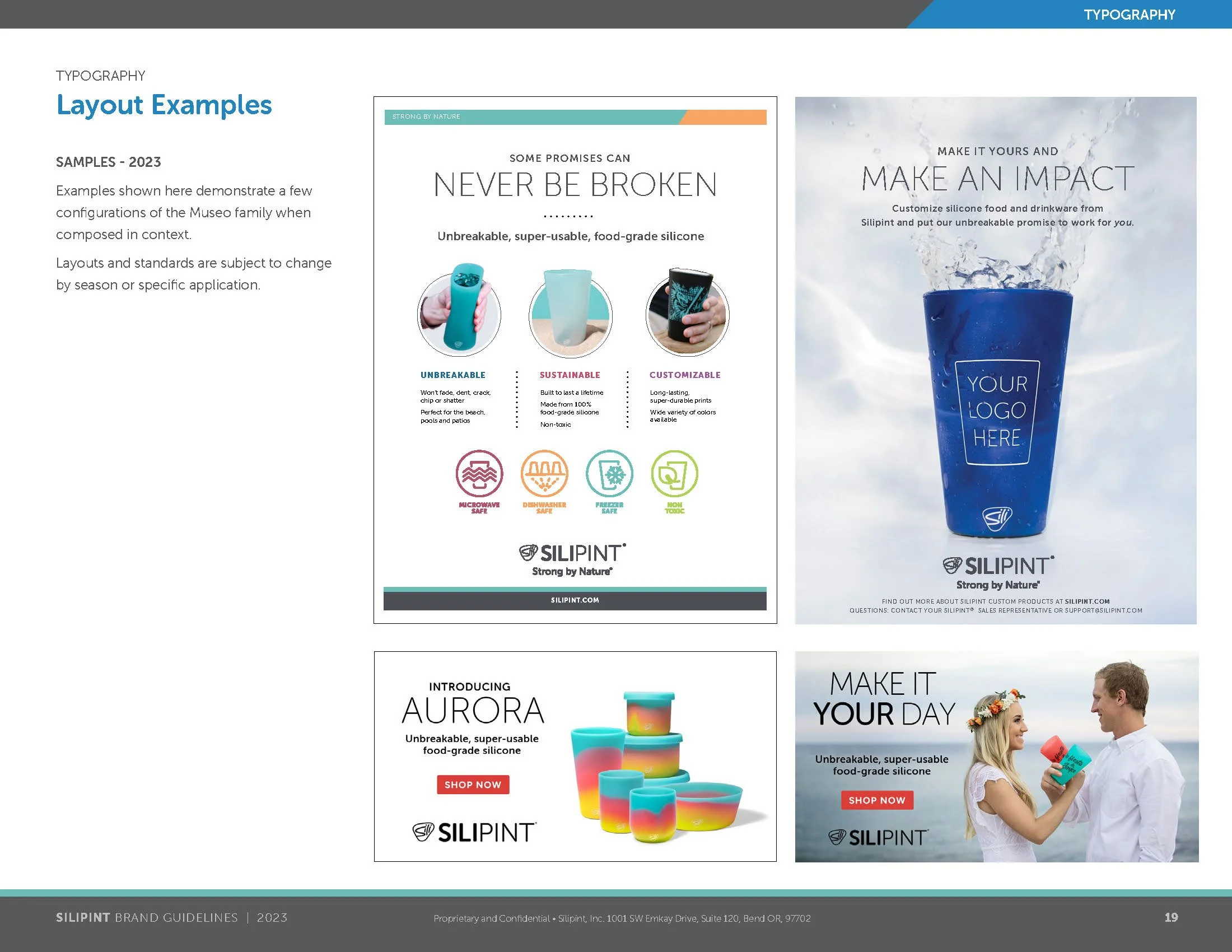
Strategic updates to the Silipint brand included a simplified use of color - preserving the gradient in a more restrained format - a more flexible and consistent typeface, and closer alignment with the brand mark as it appears on-product.


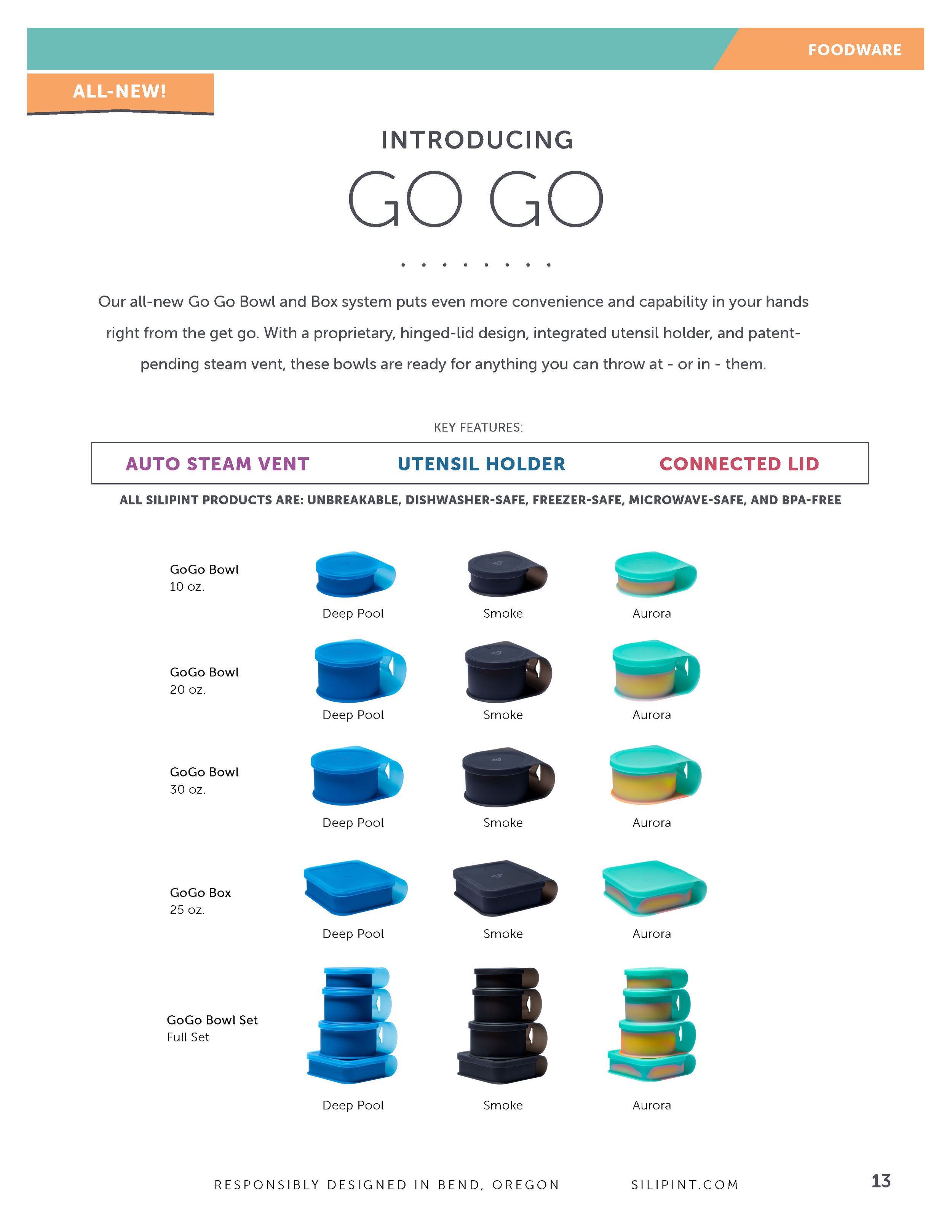
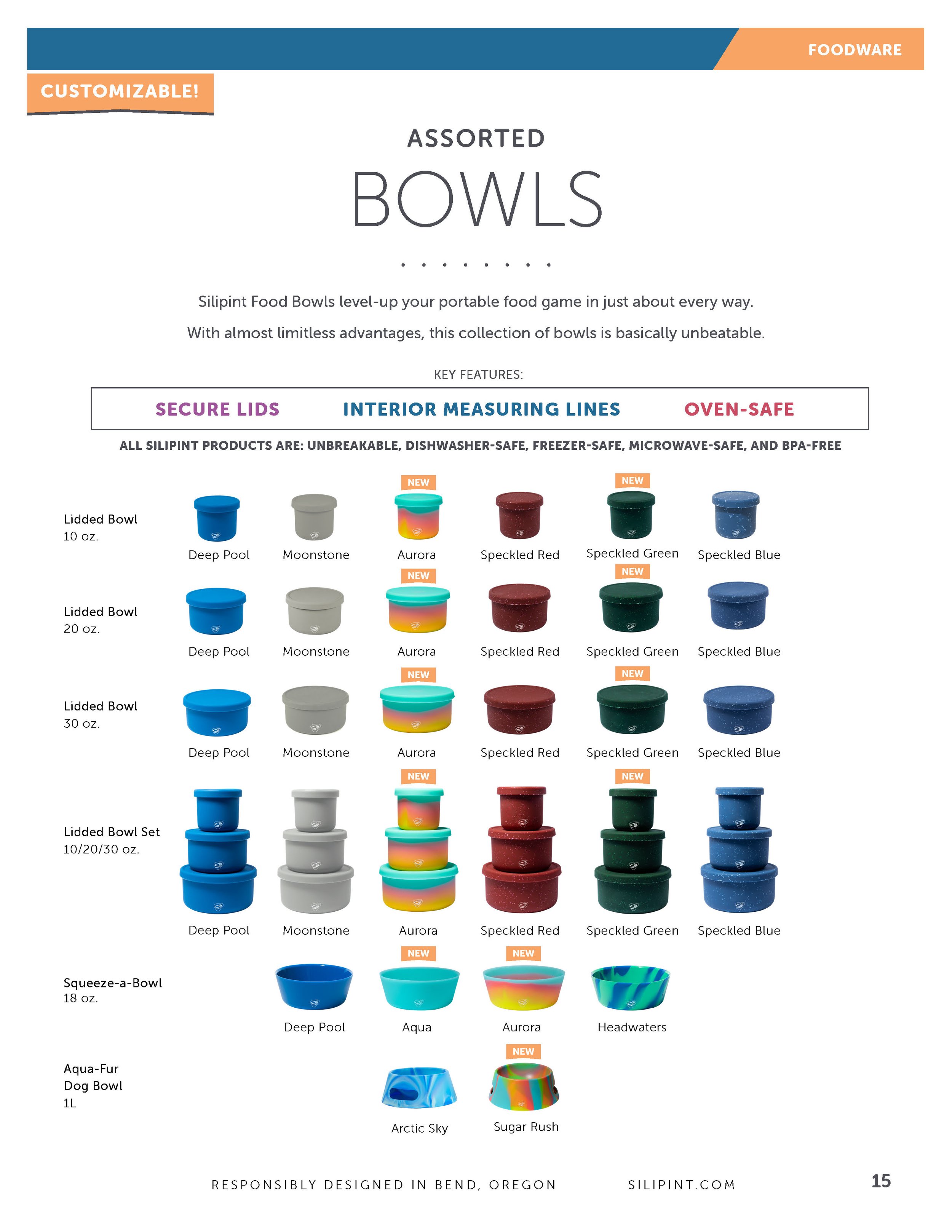
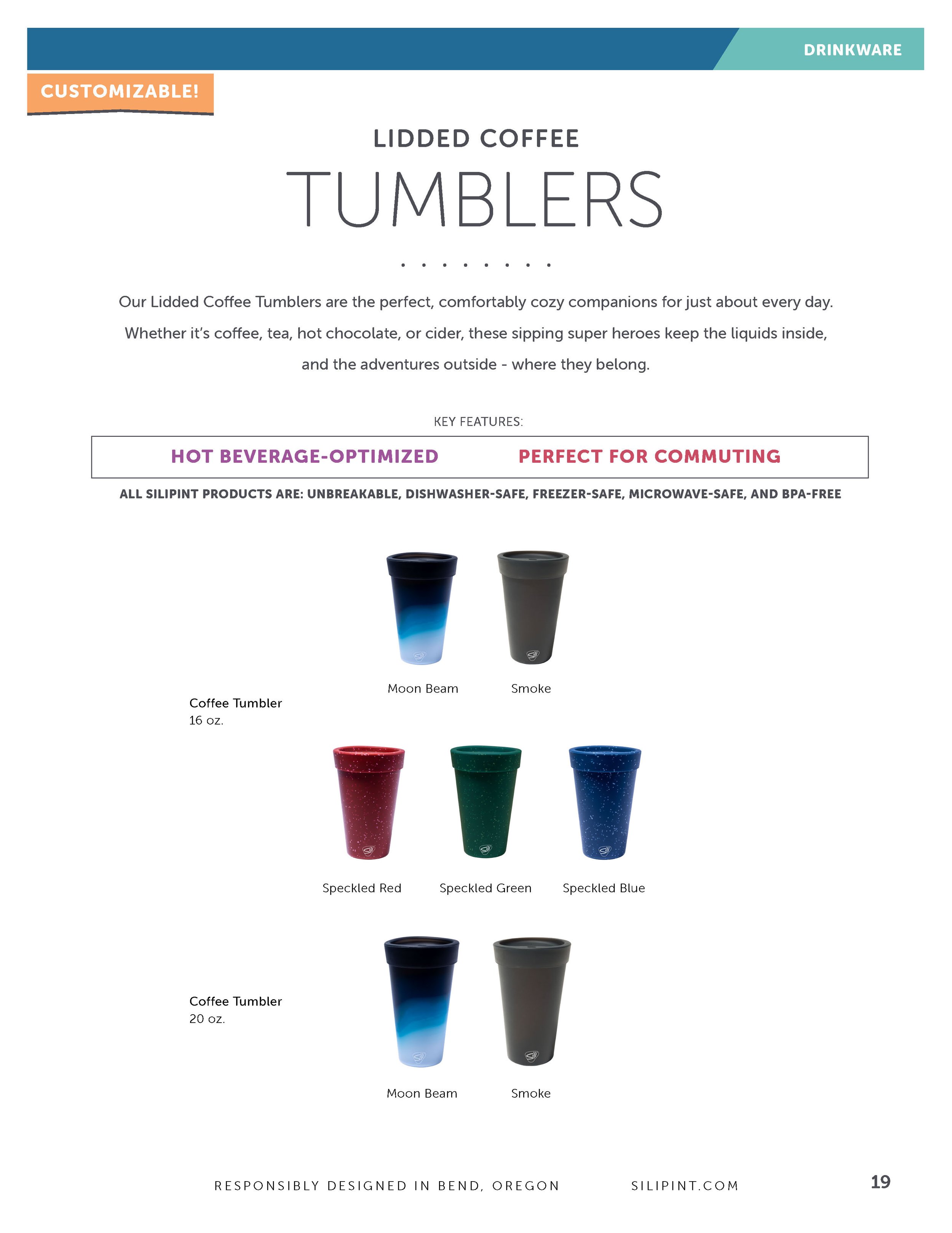
PRODUCT-DRIVEN DESIGN LANGUAGE
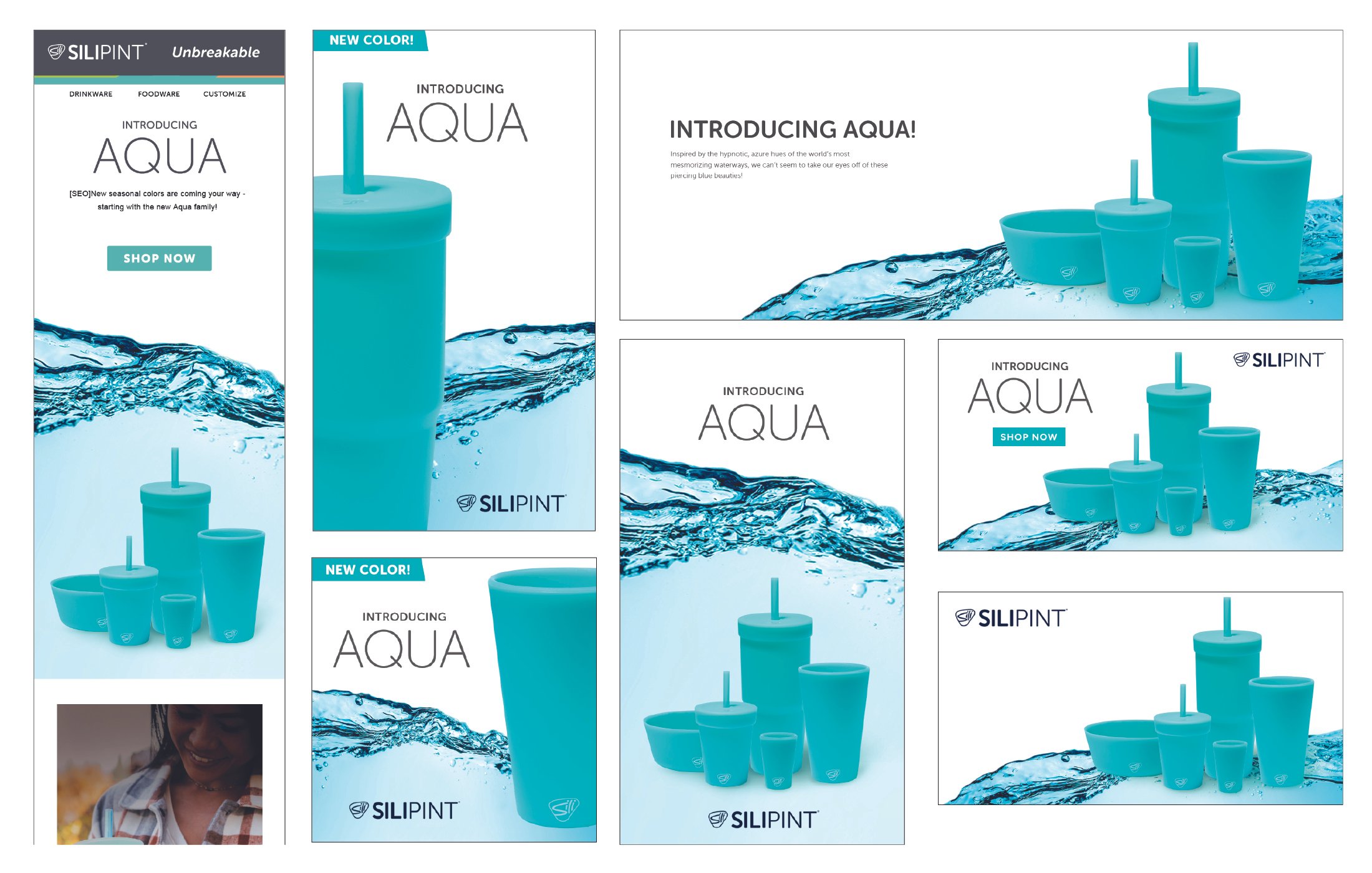
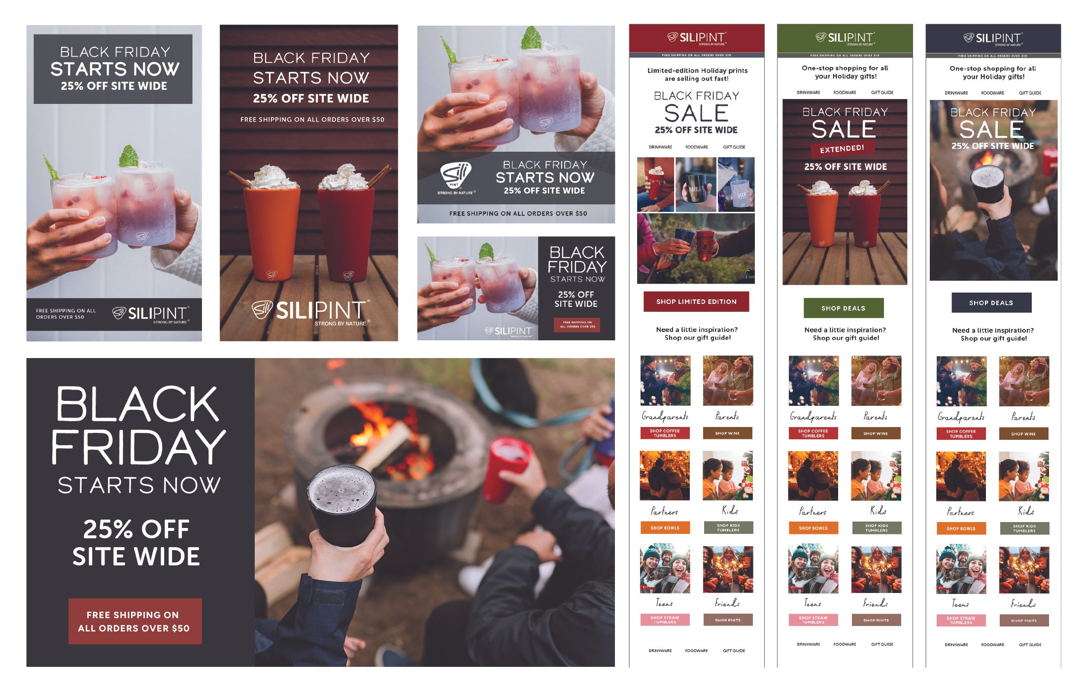
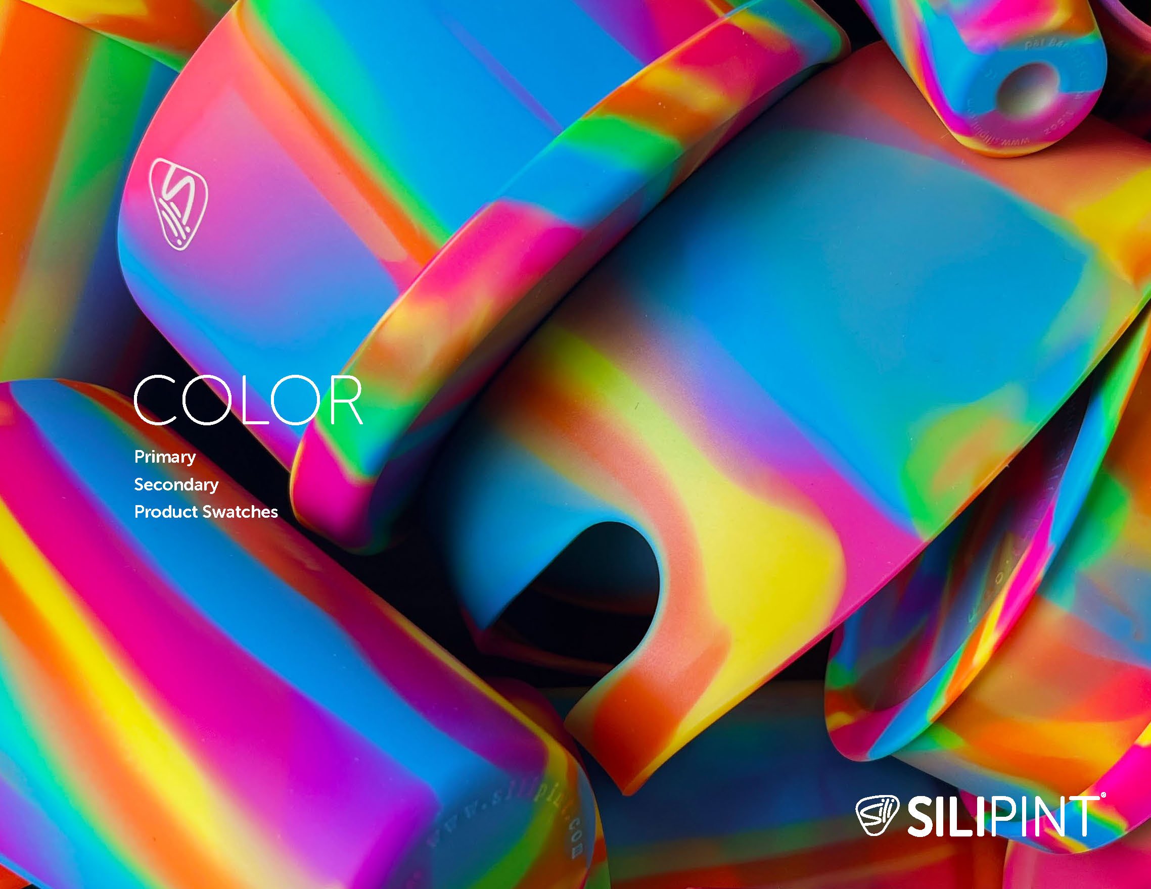
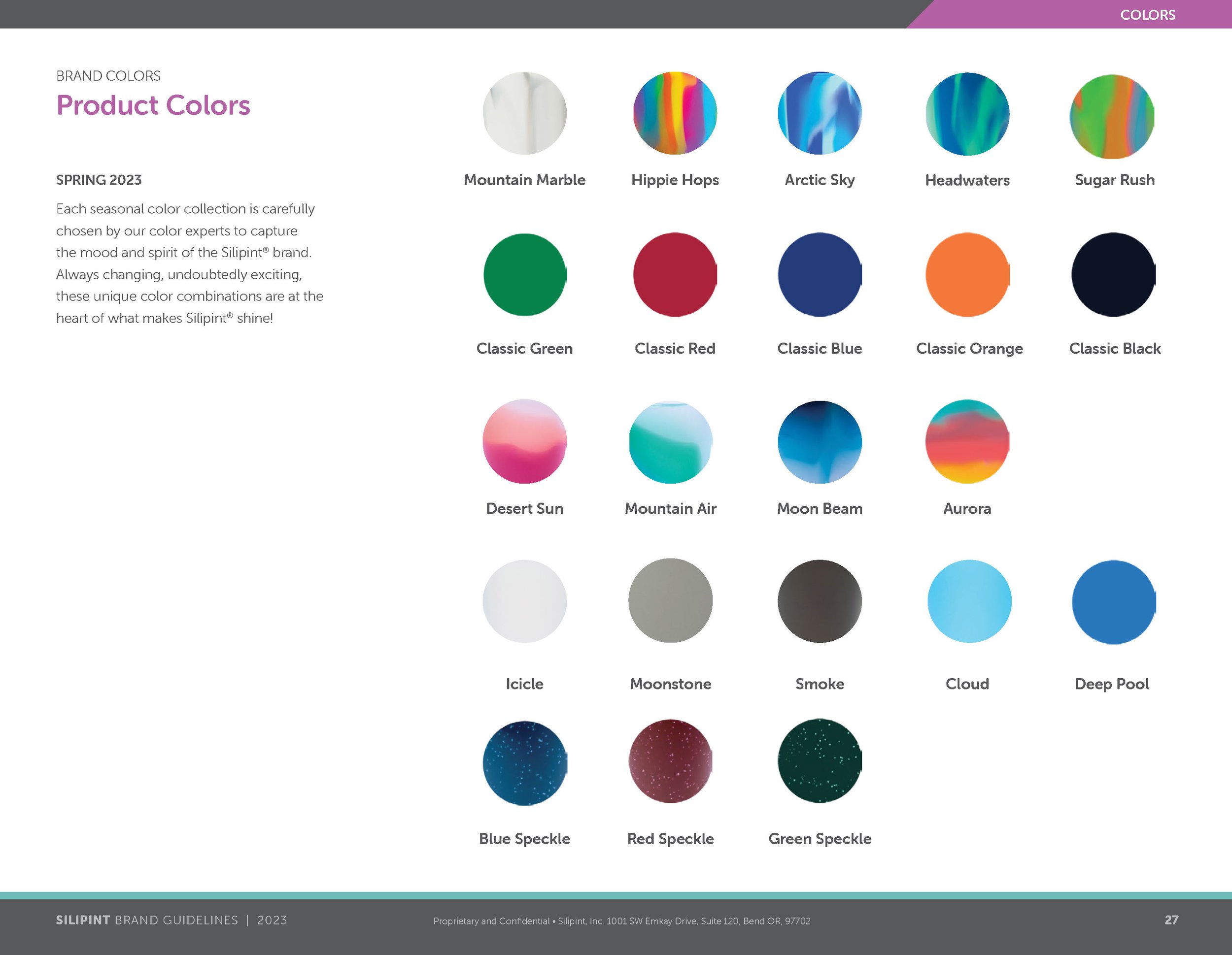
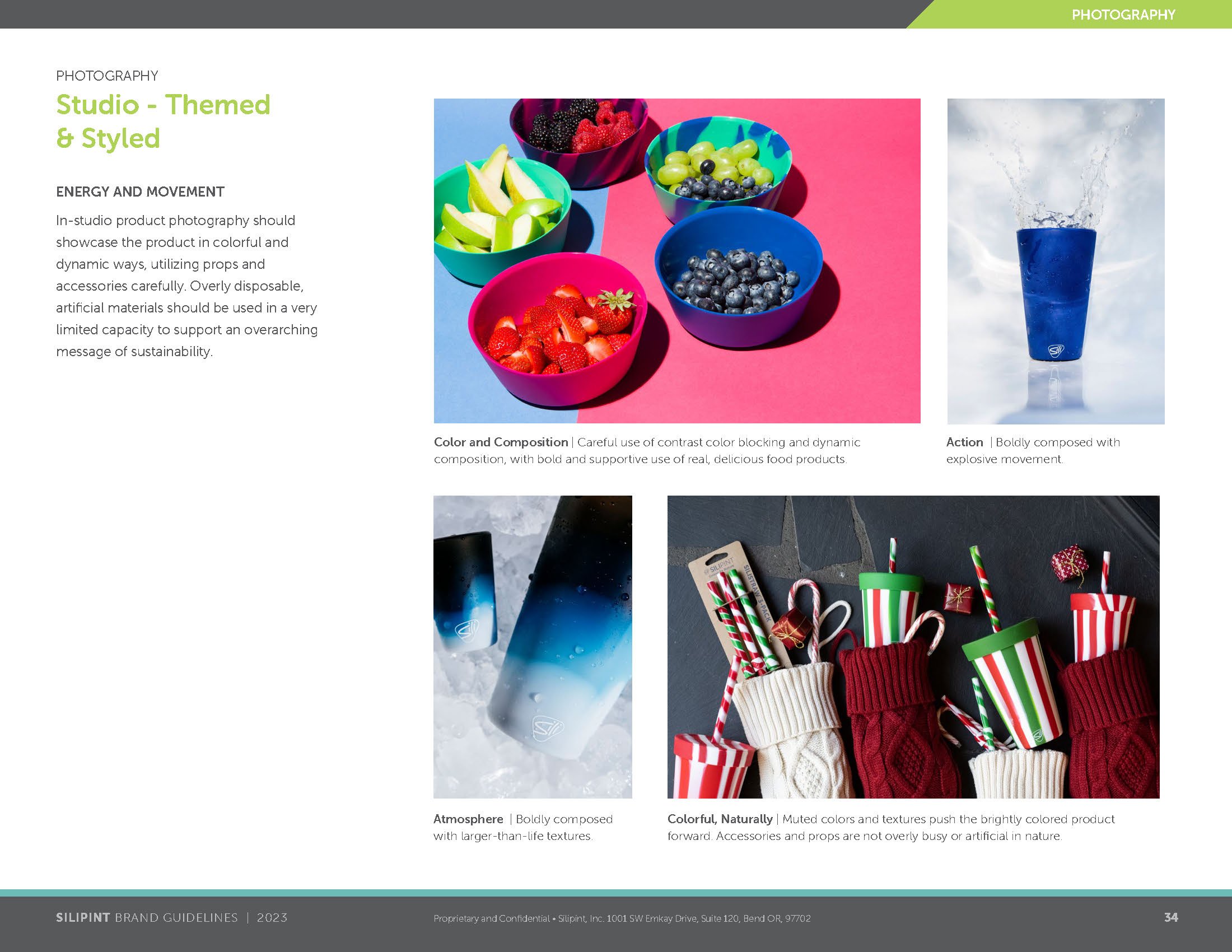
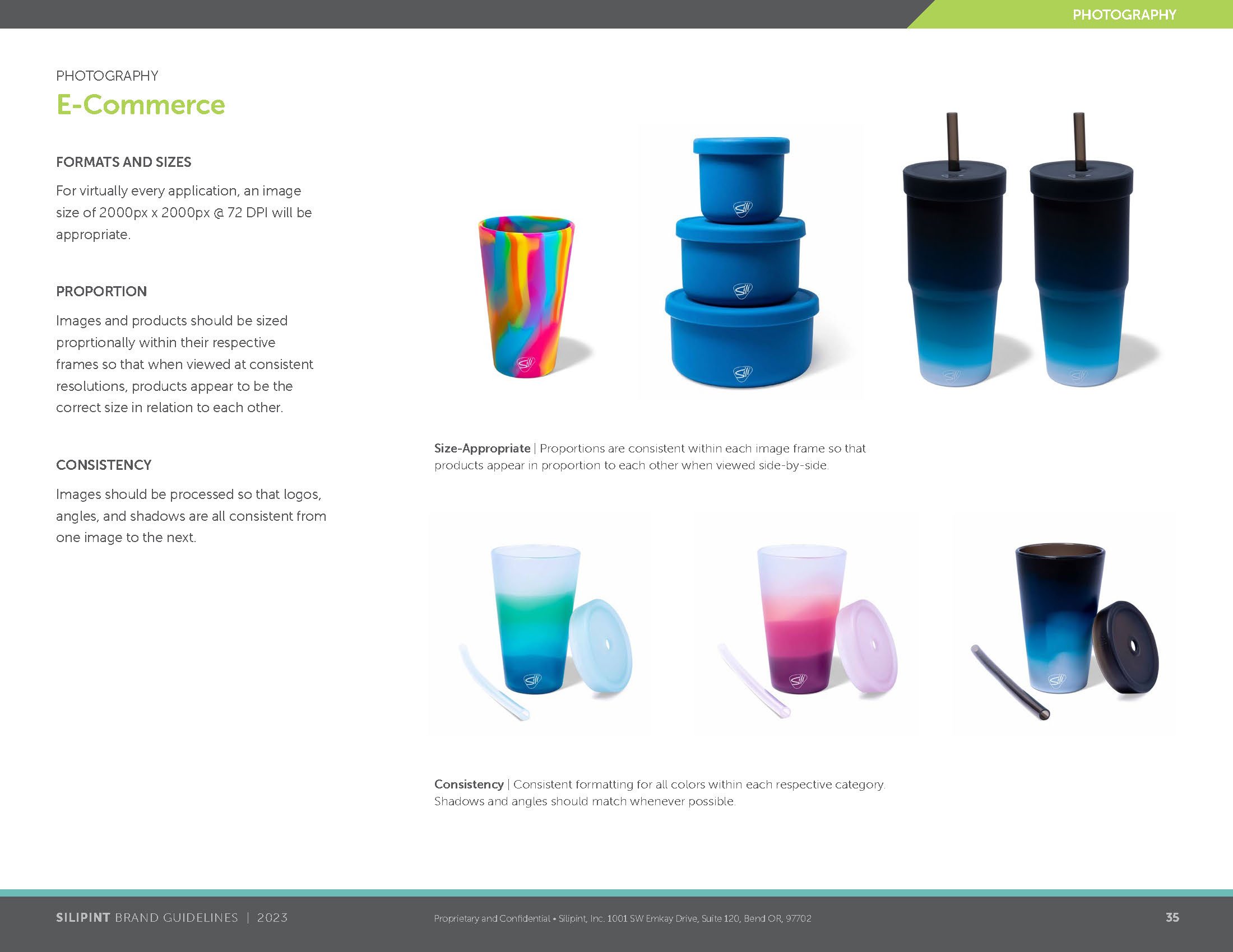
In order to anchor the visual components to an authentic foundation, a basic design language was developed that was inspired by the products themselves. Intended to evolve both seasonally and as the brand itself matured, this set of visual standards spoke not only to the tenants of the brand, but the colorful DNA of the products, themselves.

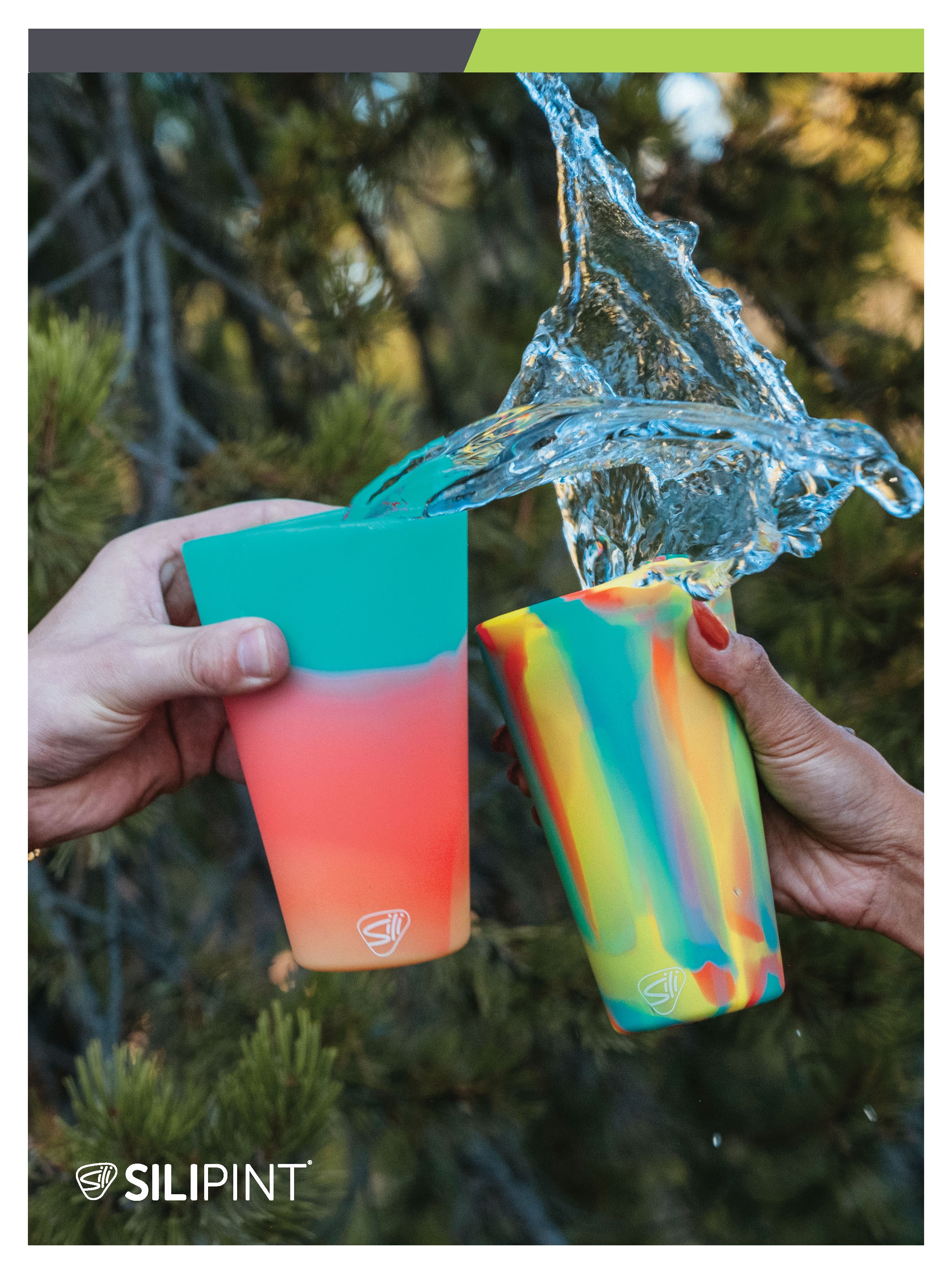
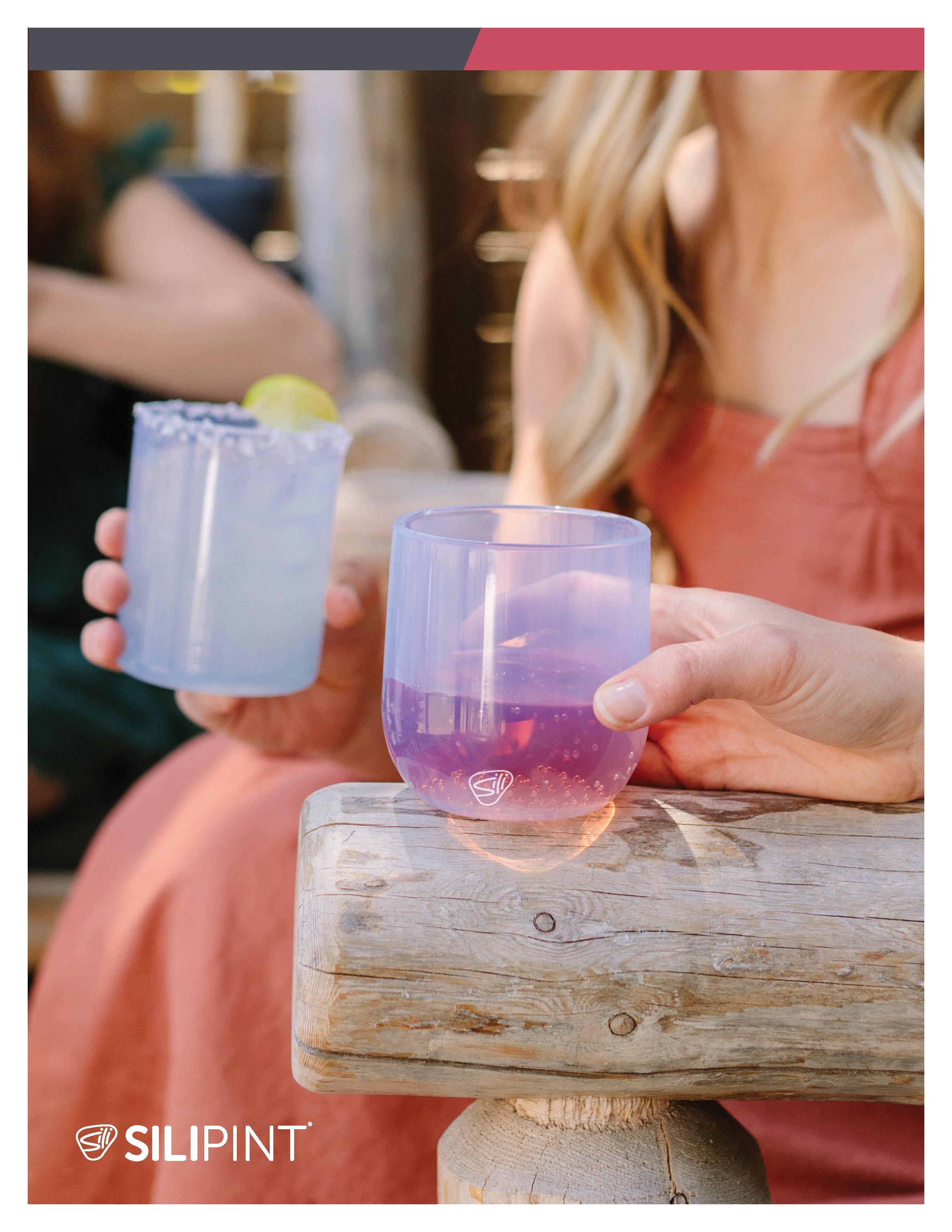
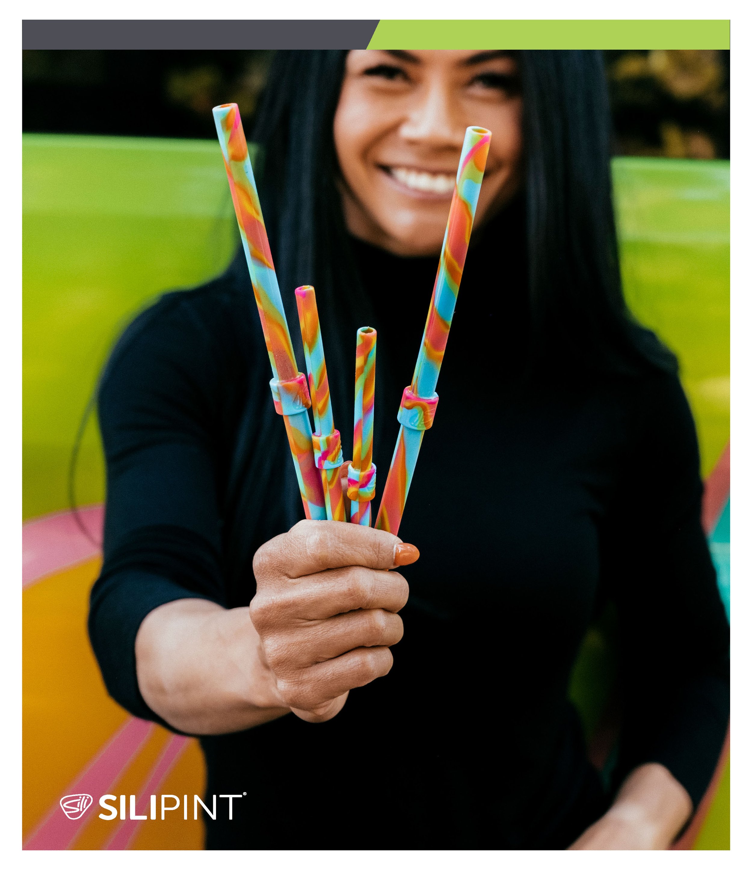
SEASONAL CATALOG
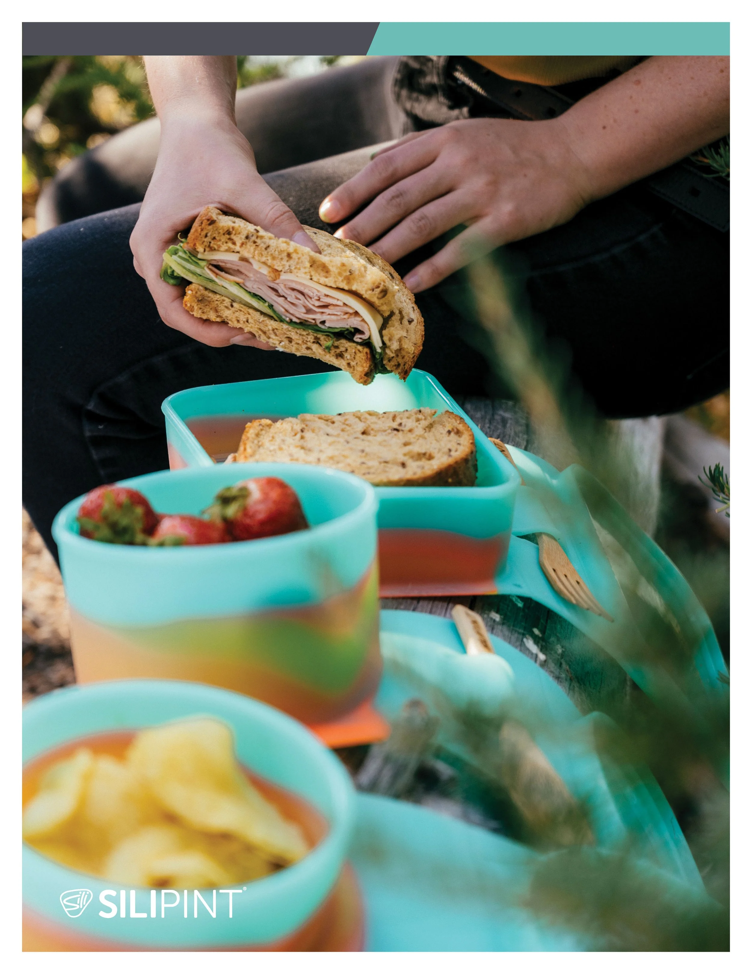
The Spring 2023 catalog was the first time the full set of brand updates were integrated into a cohesive document. This provided ample flexibility for our sales team in preparation for wider, nationwide retail availability.


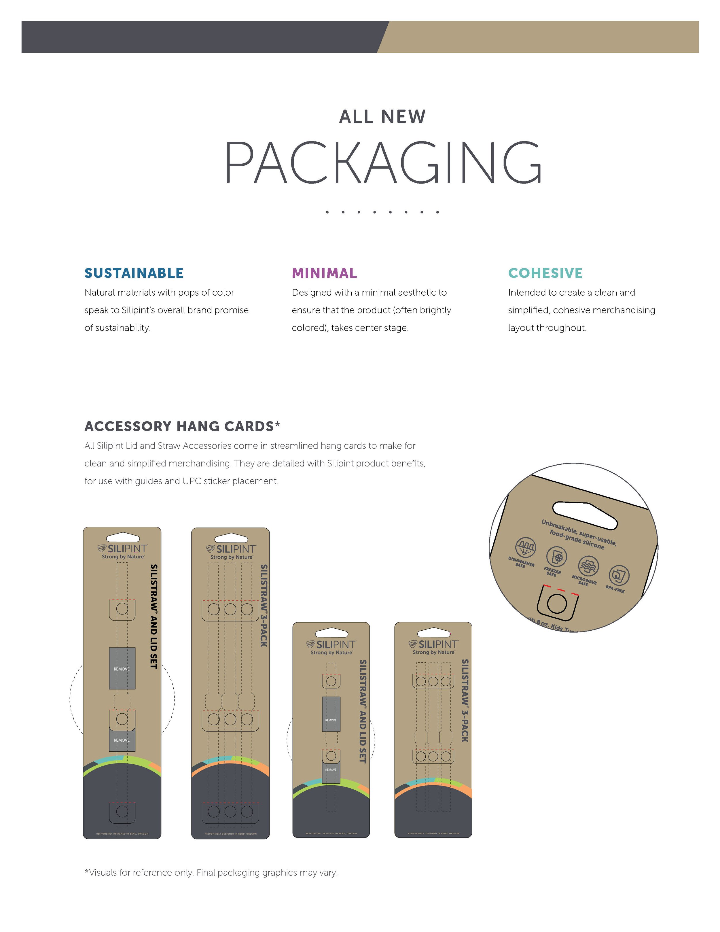
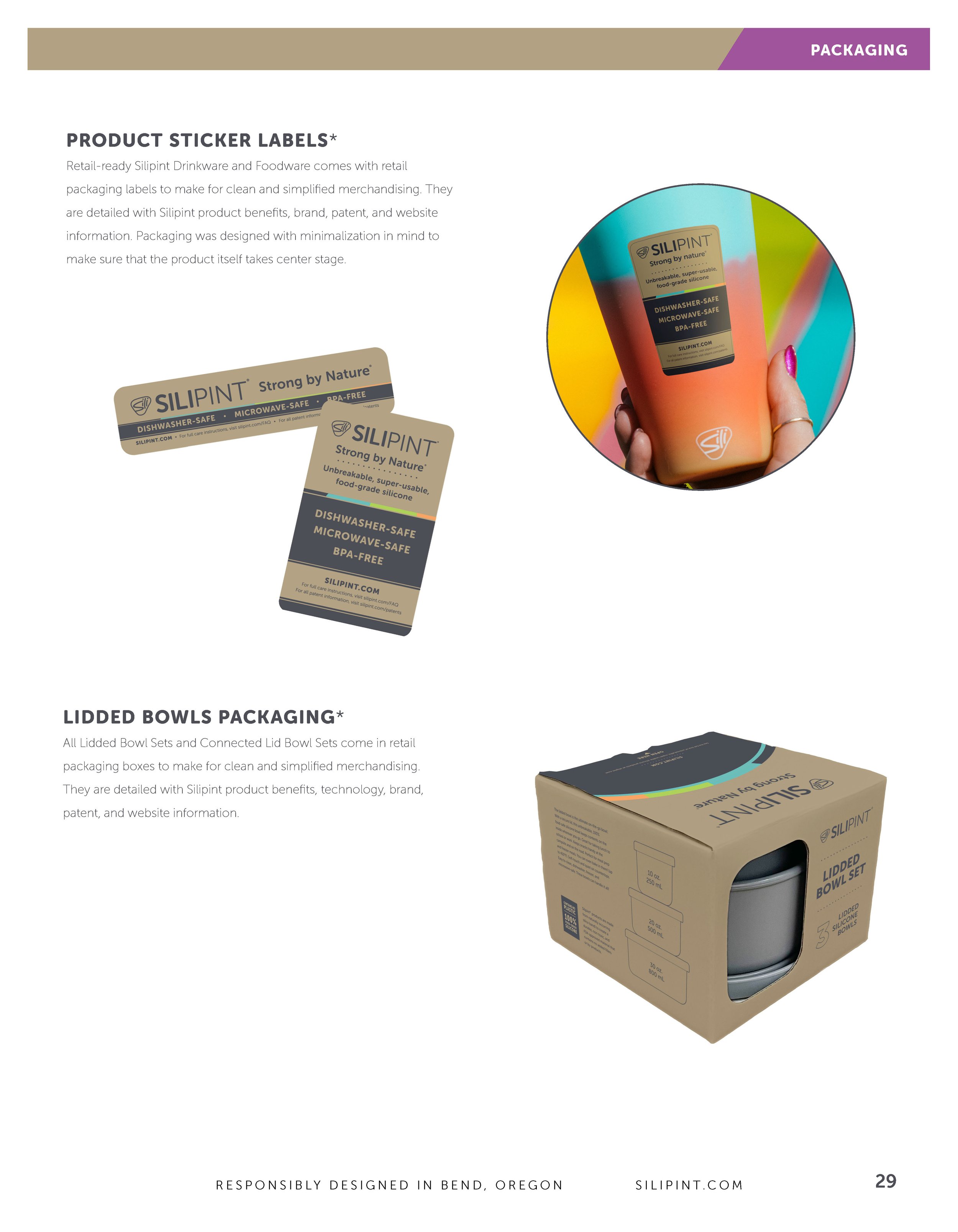
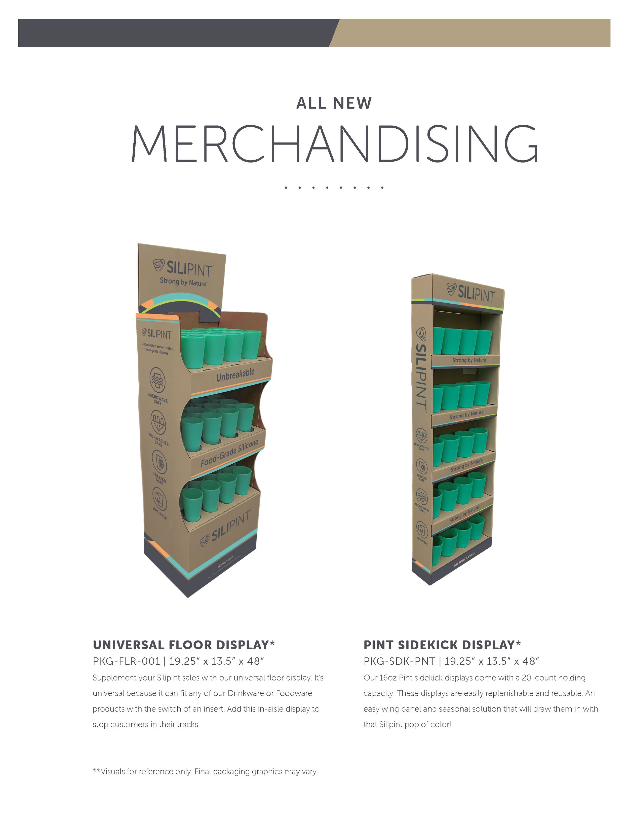


PACKAGING
Packaging strategies were developed to align with brand messages of sustainability and flexibility. Natural and craft materials speak to both of these, while also allowing the product color to feature prominently.

DIGITAL
As the sole in-house designer, social and digital strategies had to be efficient, above all else. The priority under these conditions was usually simplicity with consistency, creating micro-campaigns that would work within our very tight timelines - and even tighter budgets.