RAINSHADOW ORGANICS
Rainshadow Organics is a magical farm, teaching facility, gathering place, and so much more to so many in our community. When owner Sarahlee reached out about refreshing a few materials, it was an honor to help her grow this magnificent business by helping to bring that vision to life.
BRAND STRATEGY | DESIGN | ILLUSTRATION | COPY WRITING
BRAND UPDATE
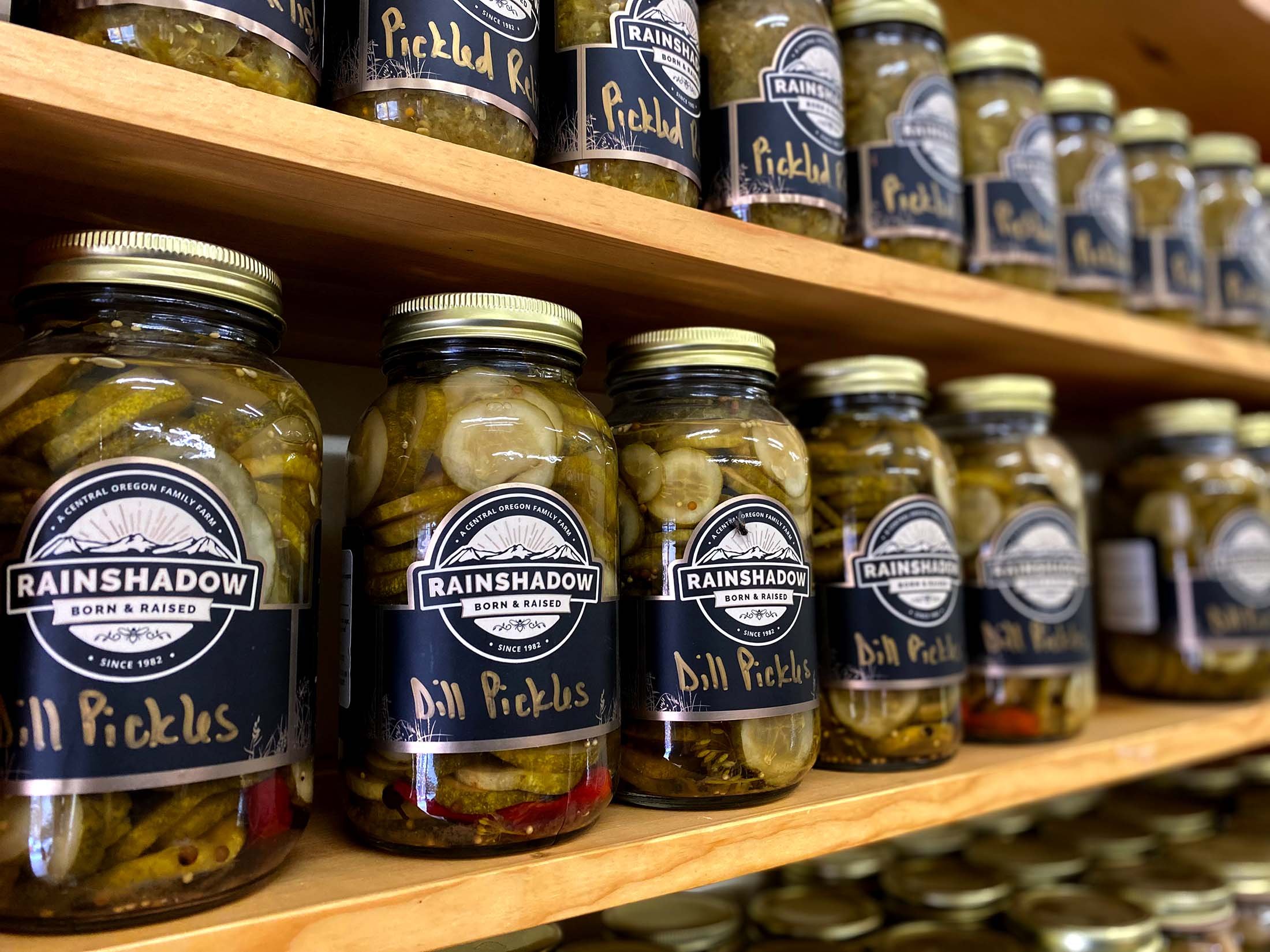
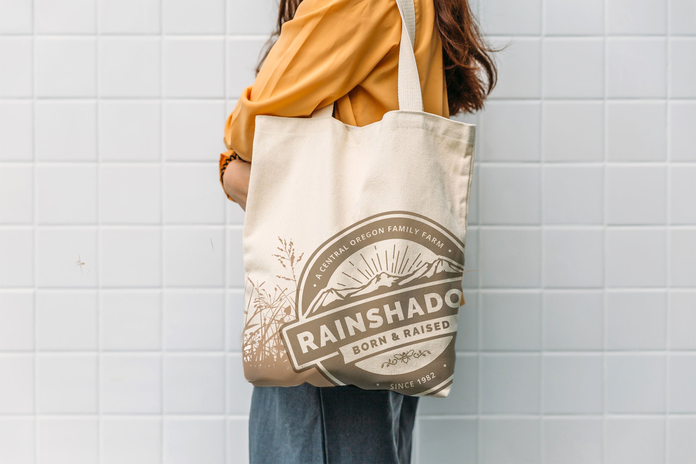
The logo update was largely driven by the secondary need for a universally-sized label that could be used on multiple different containers. The primary direction was to preserve as much of the design language as possible, while optimizing the mark for modern applications.

SCOPE AND CONSIDERATIONS
FAMILIAR DESIGN LANGUAGE
It was important to the client to preserve a sense of the original brand mark, so that a connection to the history of the farm would be maintained in some way.
OPTIMIZED FOR LABEL
The logo updates themselves were brought about by the need for a universally sized label, so this application was prioritized above all others.
WARMER COLOR PALETTE
Maintaining a warmer color palette was requested to better connect the logo to the marketing and design objectives that Rainshadow was building elsewhere.
BRAND COMPONENTES TO REVISE
UPDATED BRAND MARKS AND LABEL
SELF -GUIDED TOUR SIGNS
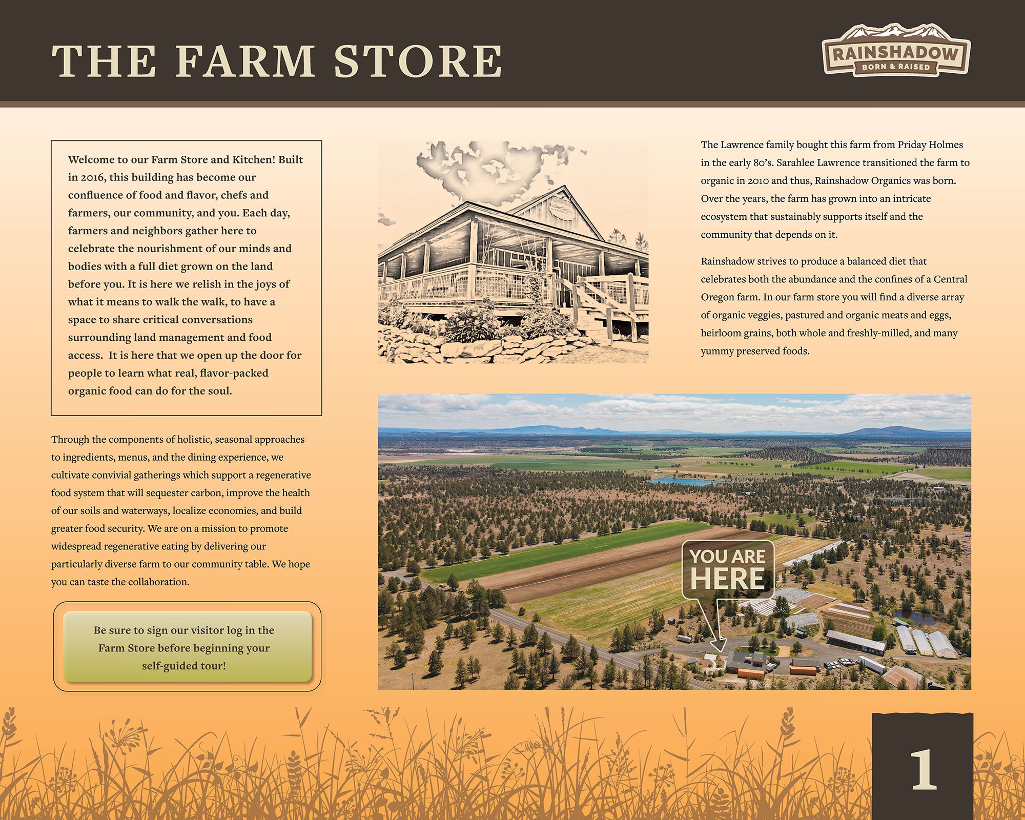
A big part of Rainshadow’s mission is to educate the community about the various practices that drive the farm. As this can be a time consuming process, we developed a set of self-guided and informational tour signs to help passively inform visitors of all of the incredible things Rainshadow is up to day-to-day.


